Last week, I wrote an A to Z about Miu Miu. It is only fitting, then, that I should also write one about its sister, Prada. The Italian house has a long heritage, but it was over the past three decades, under the direction of Miuccia Prada, that it became a symbol of avant-garde fashion, setting trends while subtly subverting them, season after season. Writers keep coming back to this balance of irony, intellect, and charm, and I’m no exception. I have written about Prada before, but this time I wanted to decode its codes and paradoxes, letter by letter.
A is for …
Avant-garde. Prada deliberately blurs the line between good and bad taste, challenging traditional ideas of beauty.
Anti-fashion. A critique of fashion itself. Miuccia Prada rejects traditional ideas in fashion, yet paradoxically, by doing so, she defines it.
B is for …
Banality. Miuccia Prada often finds beauty in the banal, transforming prim and proper clothes into extraordinary ones.
C is for …
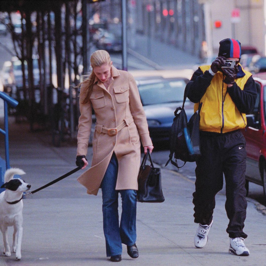
Carolyn Bessette-Kennedy. Amongst her favorite labels was Prada. In her candid photos, she wore a Prada coat that she had in three different colors (black, camel, and army green), a Prada coat with a red Formica print from the FW 1996 collection, a black V-neck sweater and a camel skirt also from the same collection, and a boxy Spazzolato tote bag. However, although she was a faithful client at Prada, New York Magazine once reported that Carolyn Bessette had asked a sales assistant to remove the brand’s logo from an outfit she’d bought from the label.
D is for …
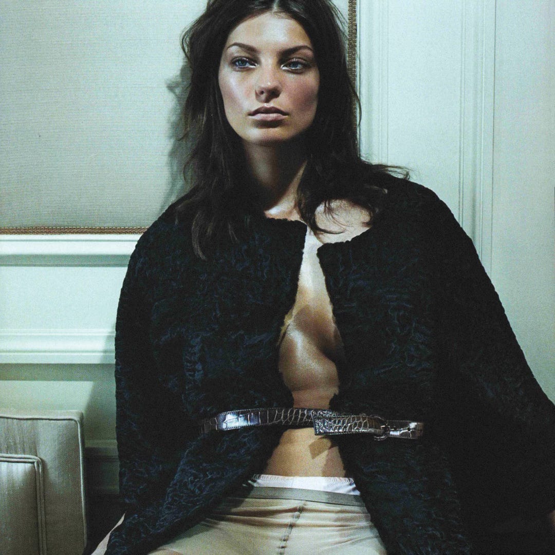
Daria Werbowy. Among other campaigns, the model starred in “Thunder Perfect Mind,” a short film that portrayed the complexities of being a woman.
E is for …
Eccentricity. A thread running through Prada’s collections since the 1990s, often deemed “ugly chic.” Through eccentric silhouettes and color palettes, Miuccia Prada presents new perspectives on taste.
F is for …
Femininity. Not a fixed concept, but an evolving one.
Fondazione Prada. A contemporary art complex housed in an old distillery on the southeastern edge of Milan.
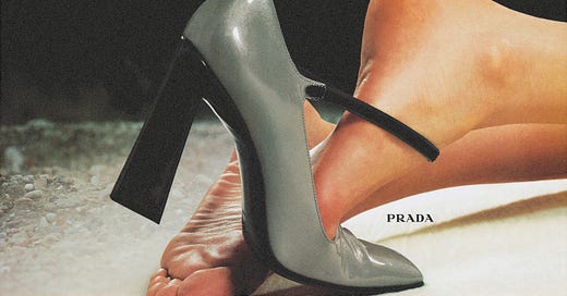
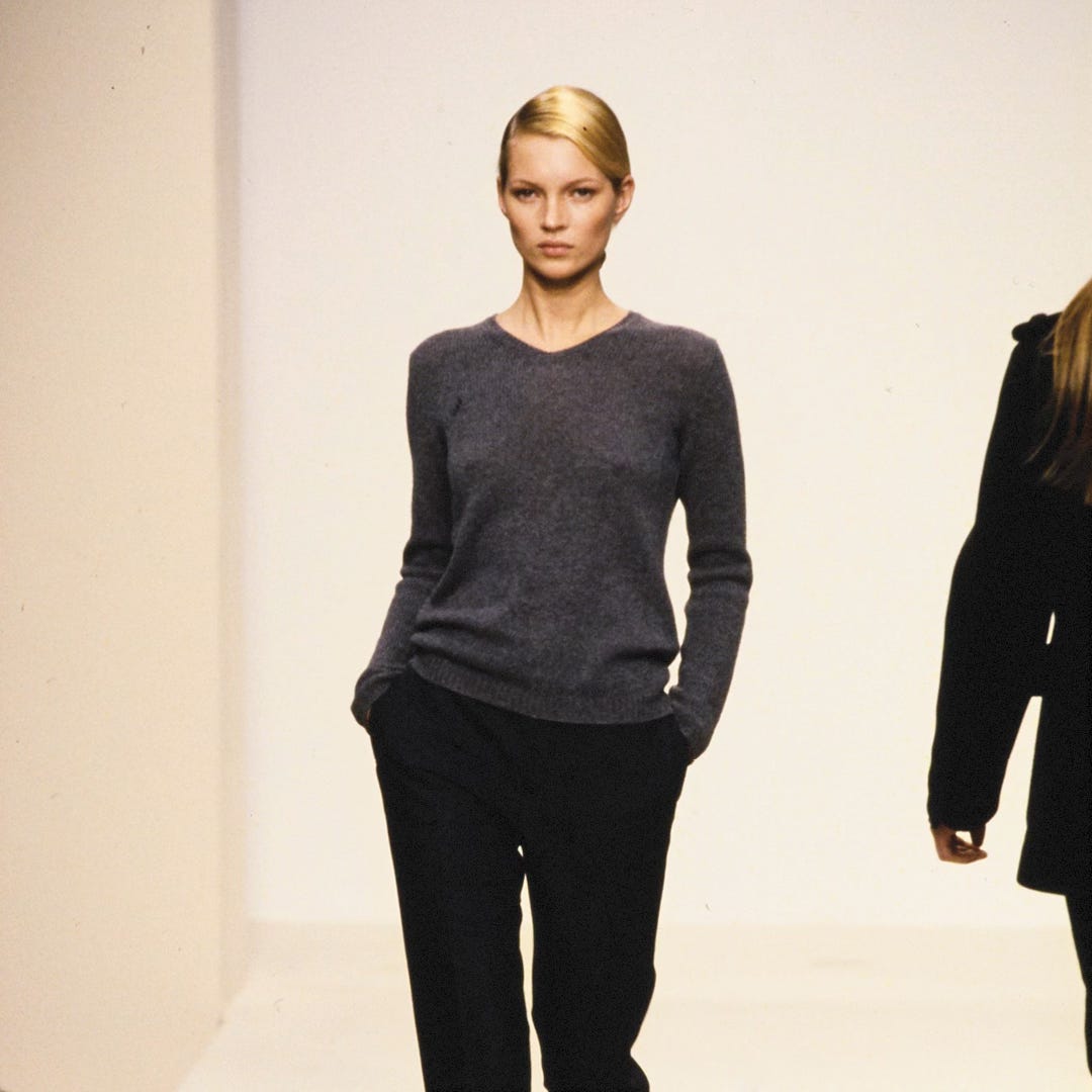
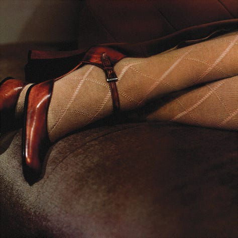
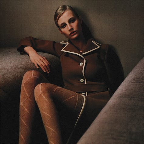
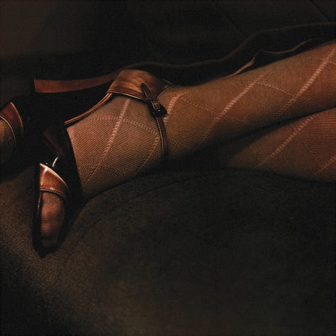
FW 1996. A continuation from the iconic SS 1996 collection. The mood for this collection was more sophisticated and muted than the previous one. The color palette consisted mainly of navy, gray, burgundy, and black, but still presented off-colors such as ochre, brown, and lilac in abstract U-patterns. Silhouettes were longer and leaner. Separates consisted of peacoats, cashmere sweaters, straight skirts, and cigarette pants. Chunky Mary-Jane shoes in antique brown leather with flower appliqués completed the geeky look.
G is for …
Galleria. Launched in 2007 and named after Prada’s flagship in Milan, the bag is a neo-classic, an heirloom in the making.
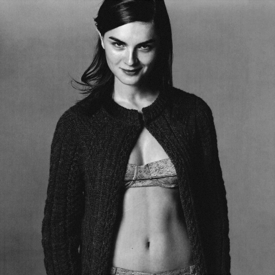
Glen Luchford. The label’s chosen photographer from the late 1990s and early 2000s campaigns.
H is for …
Heritage. Founded in 1913 by Mario Prada, the maison has a long heritage that continues through his granddaughter Miuccia Prada.
I is for …
Intellectuality. Even when clothes seem simple or naïve, there’s a deeper meaning behind them. Miuccia Prada is a master at adding nuances to her designs.
Irony. Prada’s signature. It’s not about mocking fashion but rather questioning it from within.
Italian Bourgeoisie. Prada’s collections are often social commentaries on the bourgeoisie’s aesthetics, depicting sober colors and proper clothes with a pinch of irony. As she told Vogue, “What I was really aiming for was changing from inside the system of the bourgeois.”
J is for …
Jardinière. Bag.
K is for …
Kate Moss. The runway star from the early shows, including the SS and FW 1996 collections.
L is for …
Linea Rossa. A combination of fashion and sports in a collection that emphasizes function through technological excellence.
M is for …
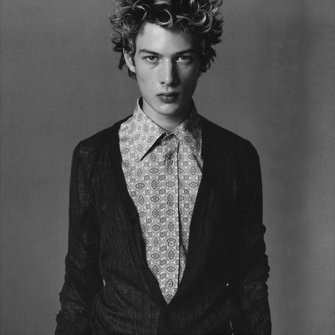
Masculinity. Also not a fixed concept, but an evolving one.
Miu Miu. Prada’s little sister. As Miuccia Prada once said, “Prada, at the end, is what I am, and Miu Miu is what I would like to be”.
Miuccia Prada. The one behind it all.
N is for …
Normcore. Before it had a name.
Nylon. Prada’s black nylon backpack with crocodile trims, introduced in 1984, became an icon of anti-fashion. Practical, technical, and minimal, it established Miuccia Prada’s avant-garde approach to fashion. Since then, the textile has been used in anything and everything.
O is for …
Opposites. Prada thrives in the space between paradoxes—femininity and masculinity, good taste and bad taste, intellectuality and superficiality.
P is for …
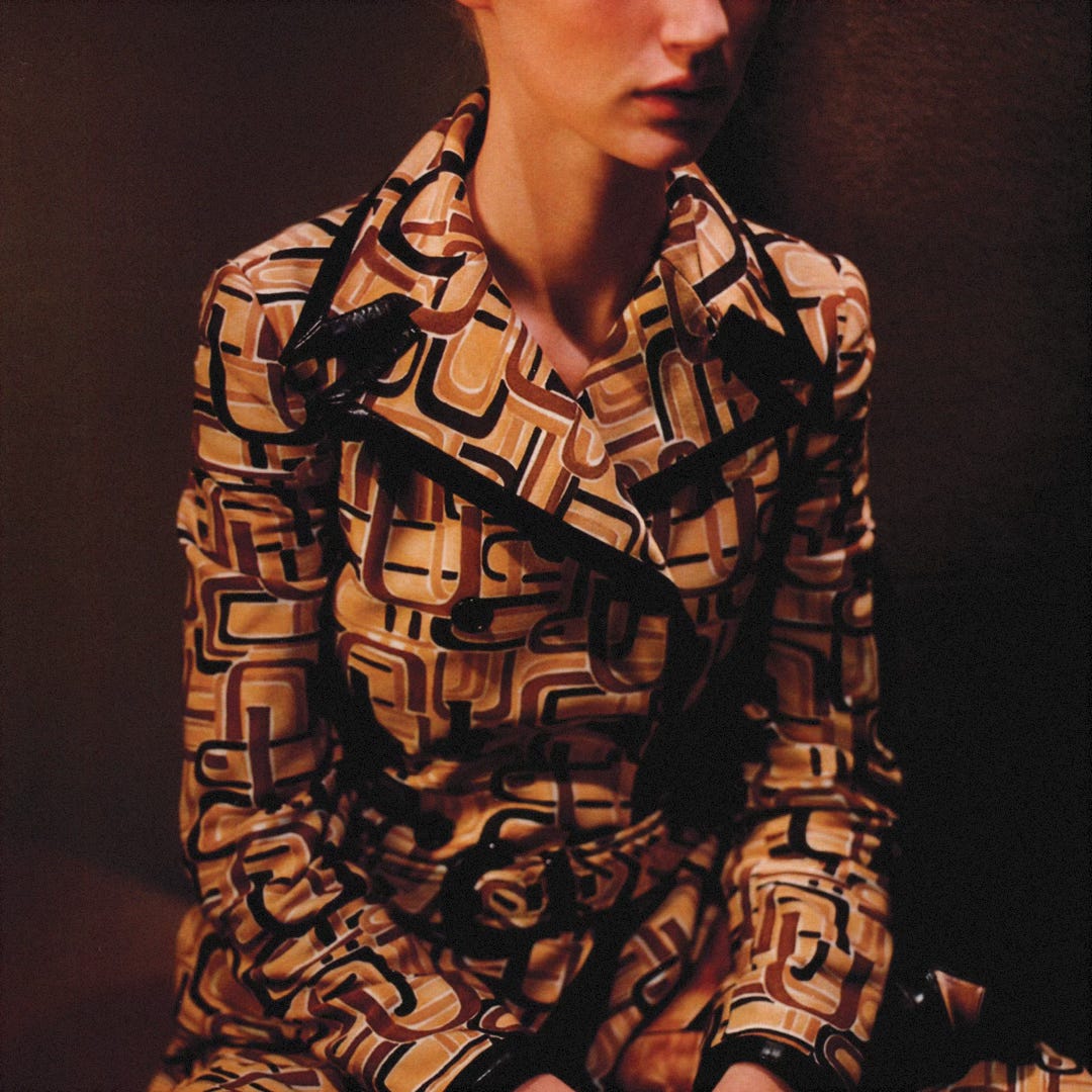
Print. Animal. Floral. Formica. Banana. Lipstick. You name it.
Q is for …
Q.
R is for …
Raf Simons. The Belgian designer joined Miuccia Prada as co-creative director of Prada in 2020. Known for his cerebral, minimalist aesthetic, Simons brought a new rhythm to Prada. While he is not involved with Miu Miu, his presence has sharpened the distinction between the two labels, allowing Miuccia Prada to put more energy into it.
S is for …
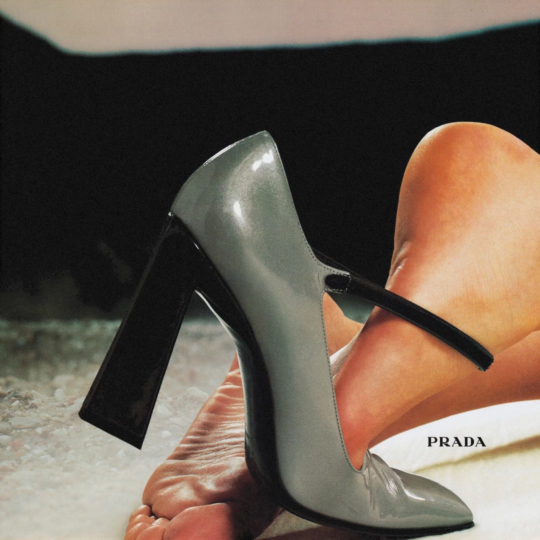
Shoes Closeup. A constant feature throughout the campaigns.
SS 1996. The collection that became instantly iconic. The collection, named Banal Eccentricity, was inspired by ordinary household objects, paying tribute to when “banal design was elevated to ‘Banal Art’ at the Venice Biennale in 1980.” She did so by combining geometric shapes with basic styles. The color palette consisted of green, ochre, brown, lilac, and white. The patterns were seemingly inspired by Formica tiles and tablecloth textiles; while some were printed onto synthetic textiles, others were printed onto tweeds of cotton, causing a trompe-l’oeil effect. Separates consisted mostly of classic striped button-ups, polo shirts, knee-length skirts, and straight pants. Chunky sandals and shoes completed the kitschy look.
T is for …
Taste. Good and bad. In an interview with Harper’s Bazaar in February 1996, Miuccia said, “The reason I like fashion is that it changes. And, anyway, good and bad taste are really useless terms, because everything alters with time.”
The Postman Dreams. A series of five humorous short films directed by Autumn de Wilde. The first series includes: “The Postman,” “The Makeout,” “The Battlefield,” “The Tree,” and “The Laundromat”. The second series includes: “The Bogey,” “The Troublemaker,” “The Punch,” “The Elevator,” “The Candy Jar,” “The Bubbles,” and “The Jacket”. (All worth watching.)
Triangle. One of the few signifiers of the label.
U is for …
Ugly. But chic. Regarding the SS 1996 collection, Robin D. Givhan said at the time: “Prada is still ugly. Given enough time, the eye can adjust to anything. Except, perhaps, this.”
Uniform. But unique.
V is for …
Vintage. Prada consistently draws from the past, successfully reinterpreting references into contemporary collections.
W is for …
Wes Anderson. Prada and the film director collaborated in short films such as “Castello Cavalcanti” and “Candy L’Eau”. (Again, both are worth watching.)
X is for …
X.
Y is for …
Year 1996. When Miuccia Prada made ugly look chic.
Z is for …
Zeitgeist. Miuccia Prada sets the mood within the fashion industry, over and over and over again.
Did I miss anything you consider essential? Let me know in the comments section. I would love to grow this A to Z with your suggestions!


